
Step 1: Define the Problem
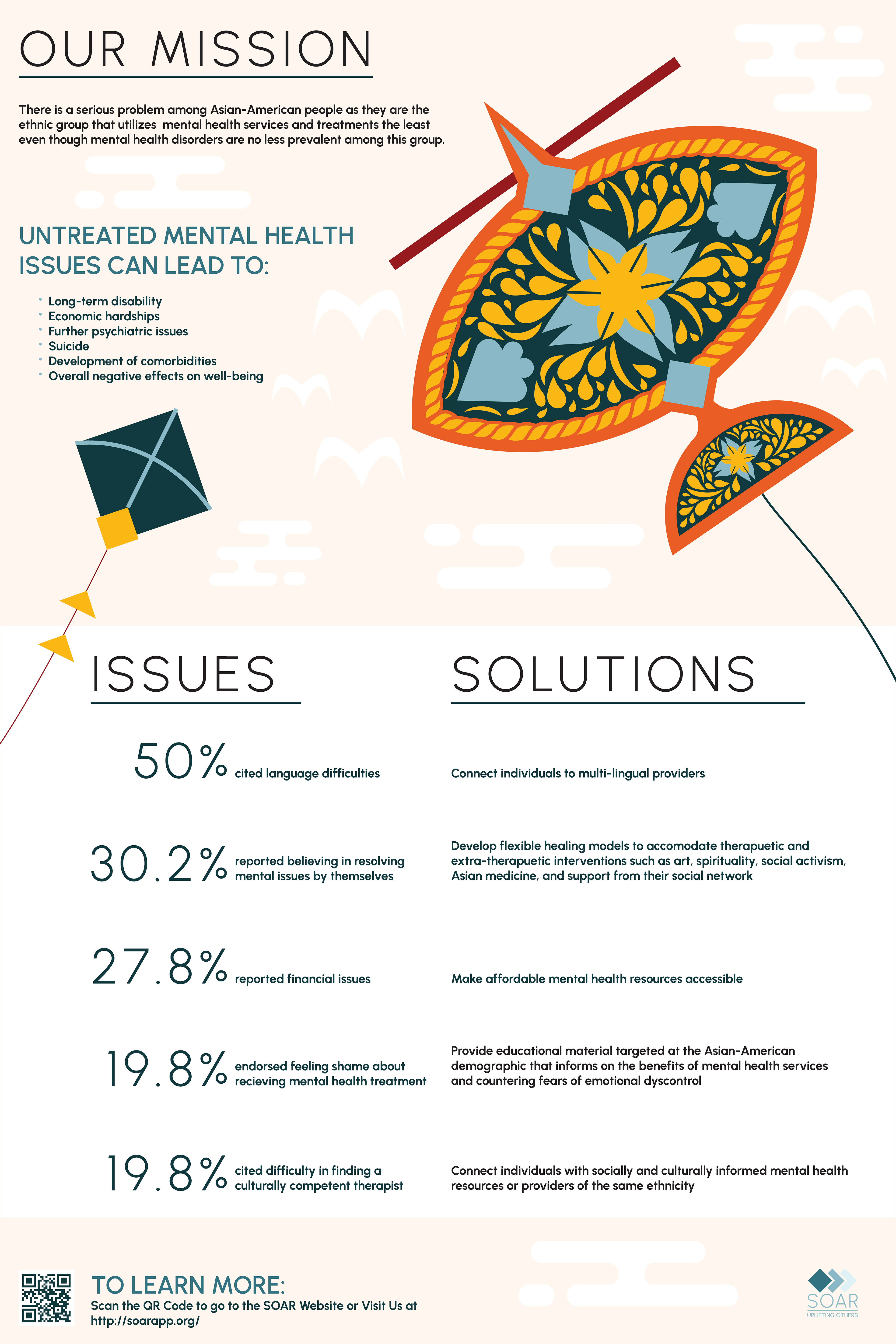
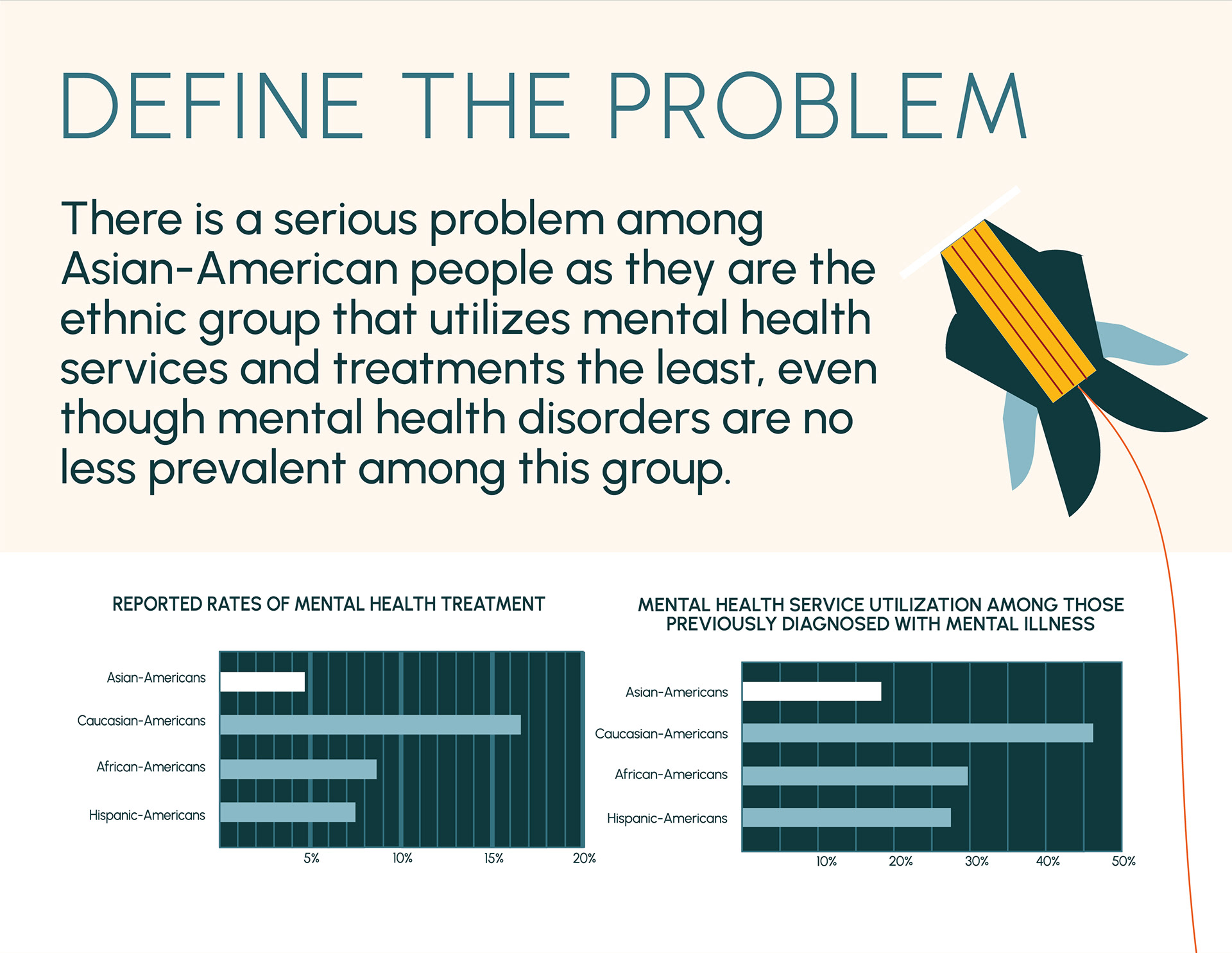
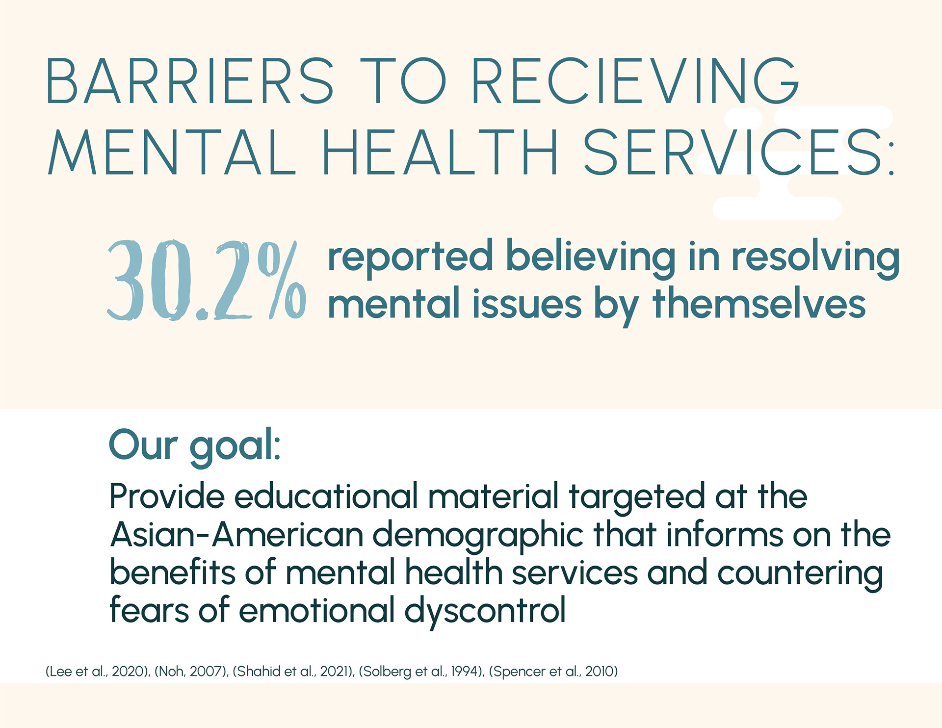
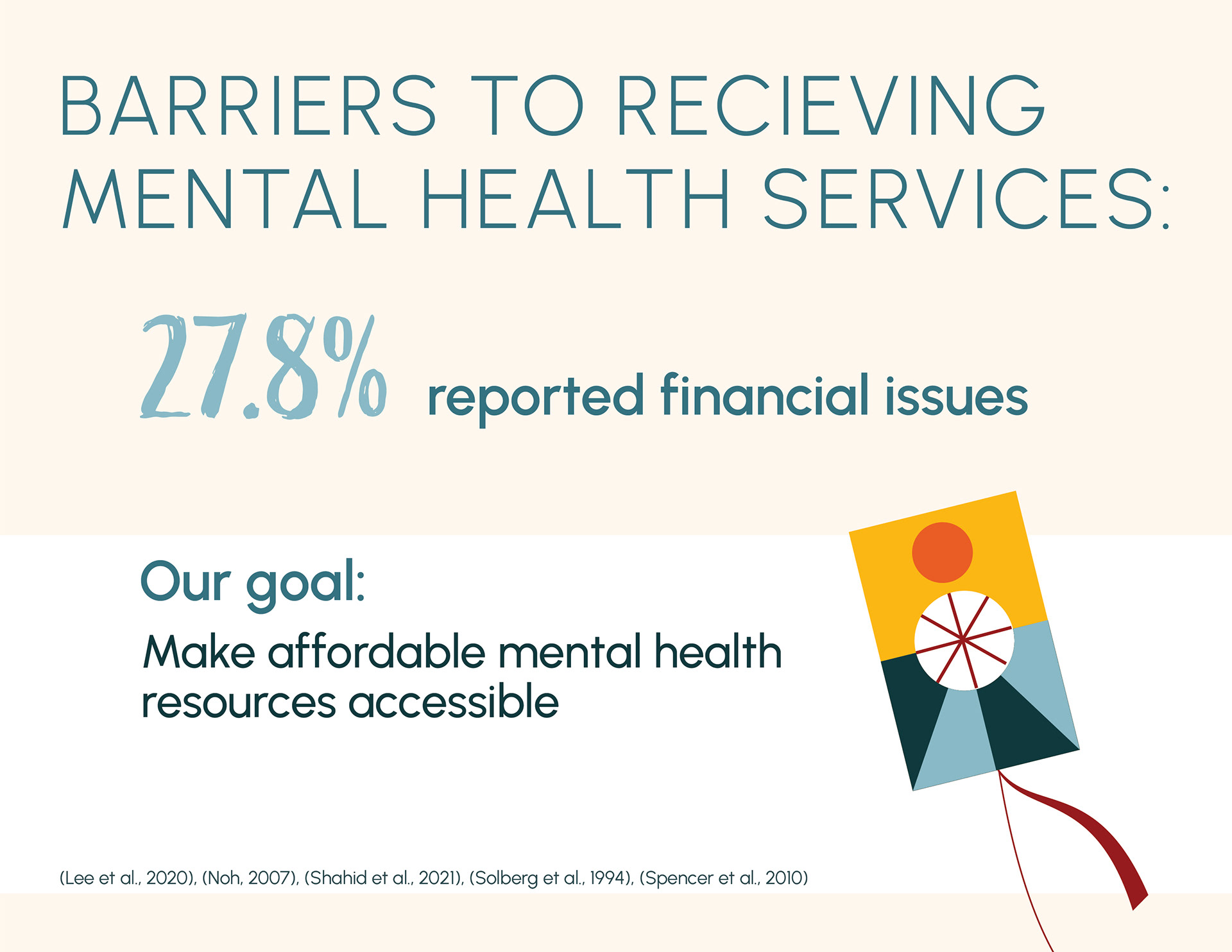
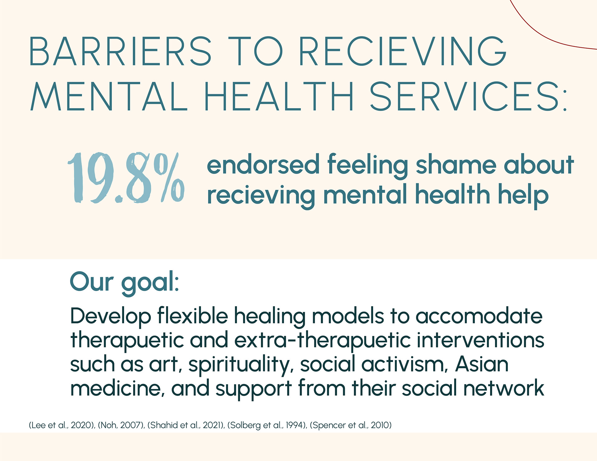
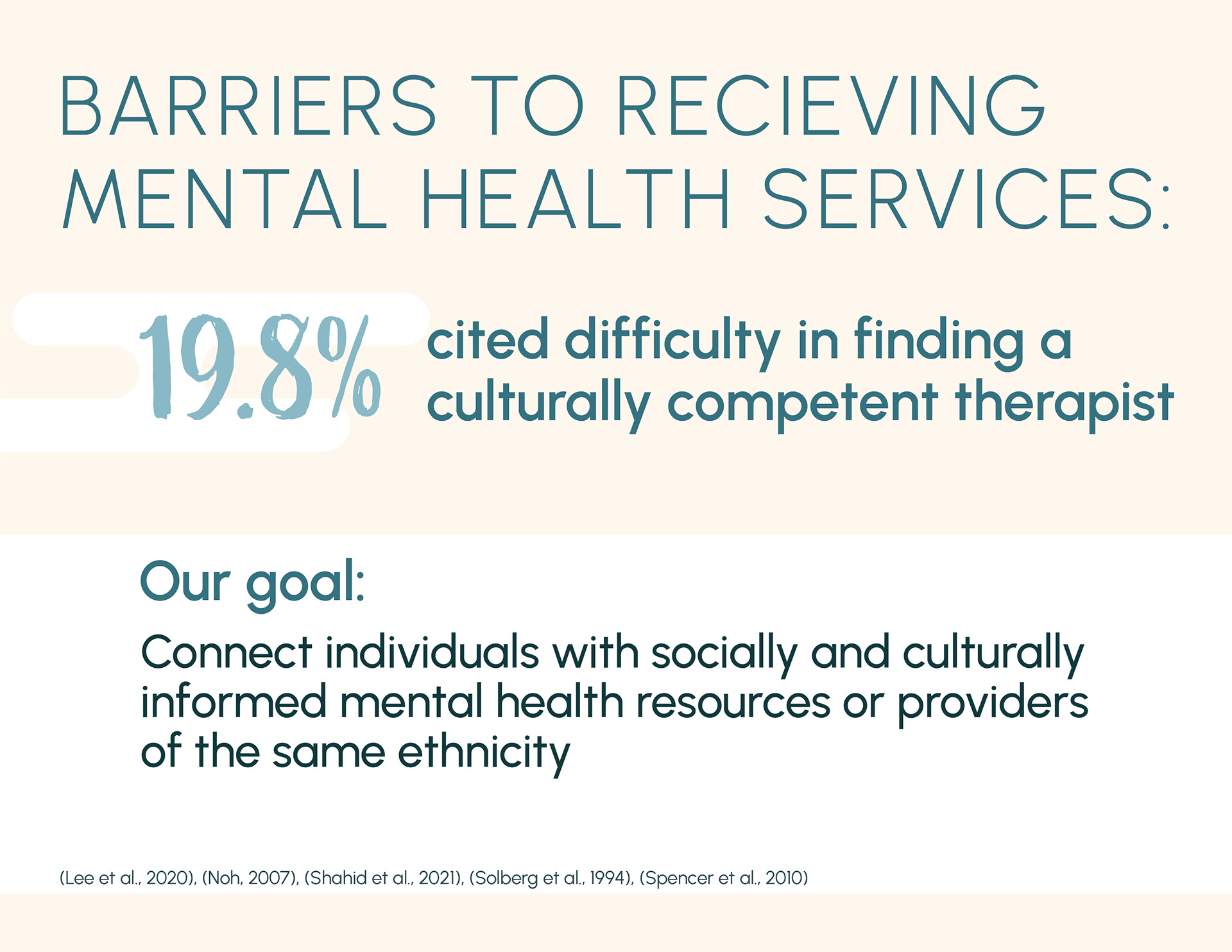
Research played a crucial part in determining the forms that this project would take. The exhibition theme was "community", and as a part of the Asian-American community, I wanted to explore some issues that my community was facing. One of the first issues that came up in my research was mental health and hesitancy of this community to seek help regarding mental health issues. Learning the most common barriers Asian-Americans experienced to receiving mental health services helped define possible solutions.


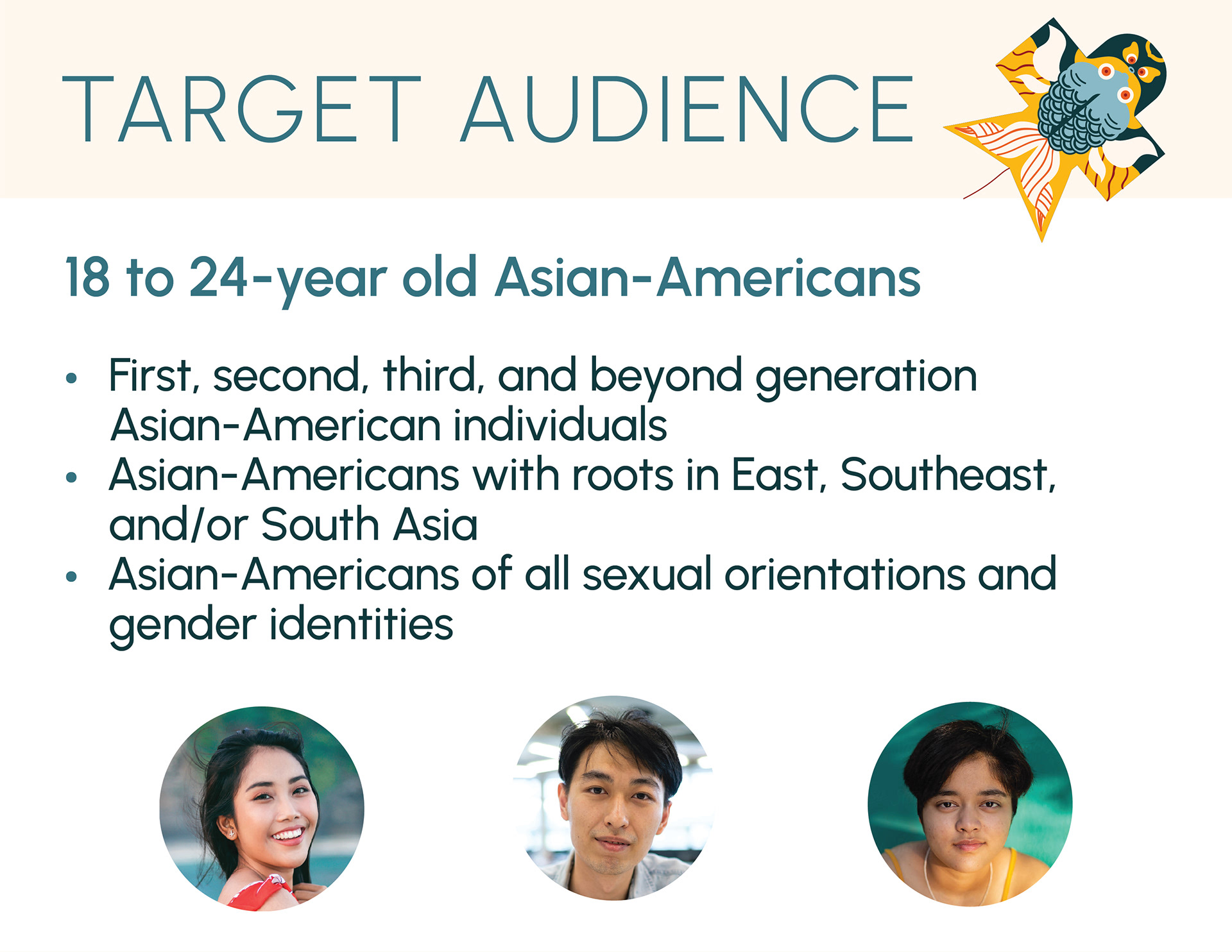
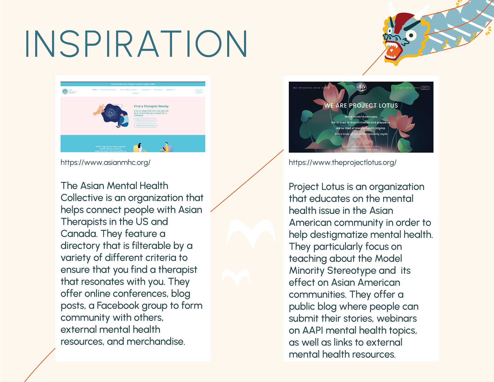
Given a target age demographic of Gen Z and the previously researched barriers, I figured that a mental health app and website would be the best way to bridge some of the barriers to receiving mental health help. I downloaded three apps that approach mental health services in different ways and audited each app to determine pros and cons to each approach. I also researched online mental health organizations for Asian Americans to see what they offered.

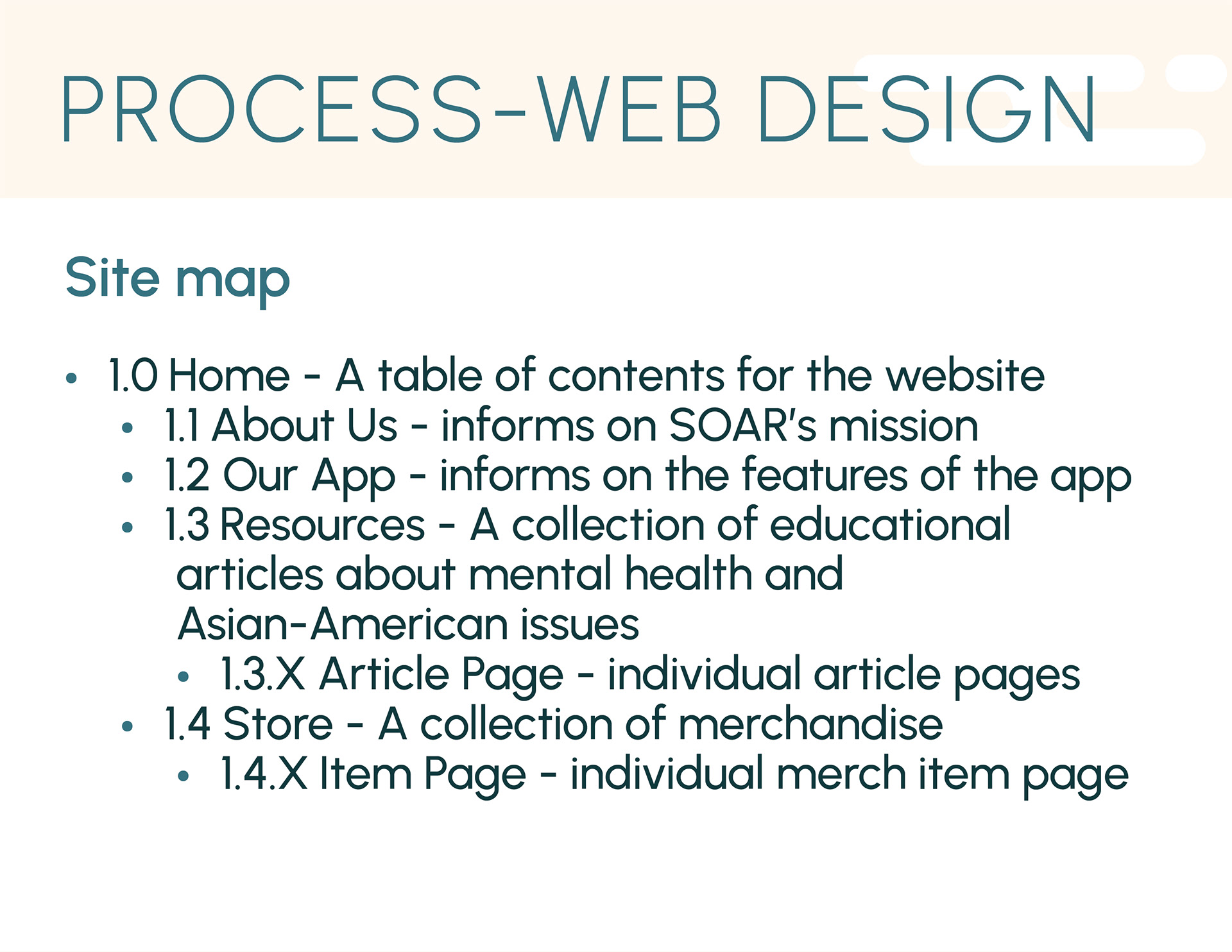
Step 2: User Flow and Site Mapping
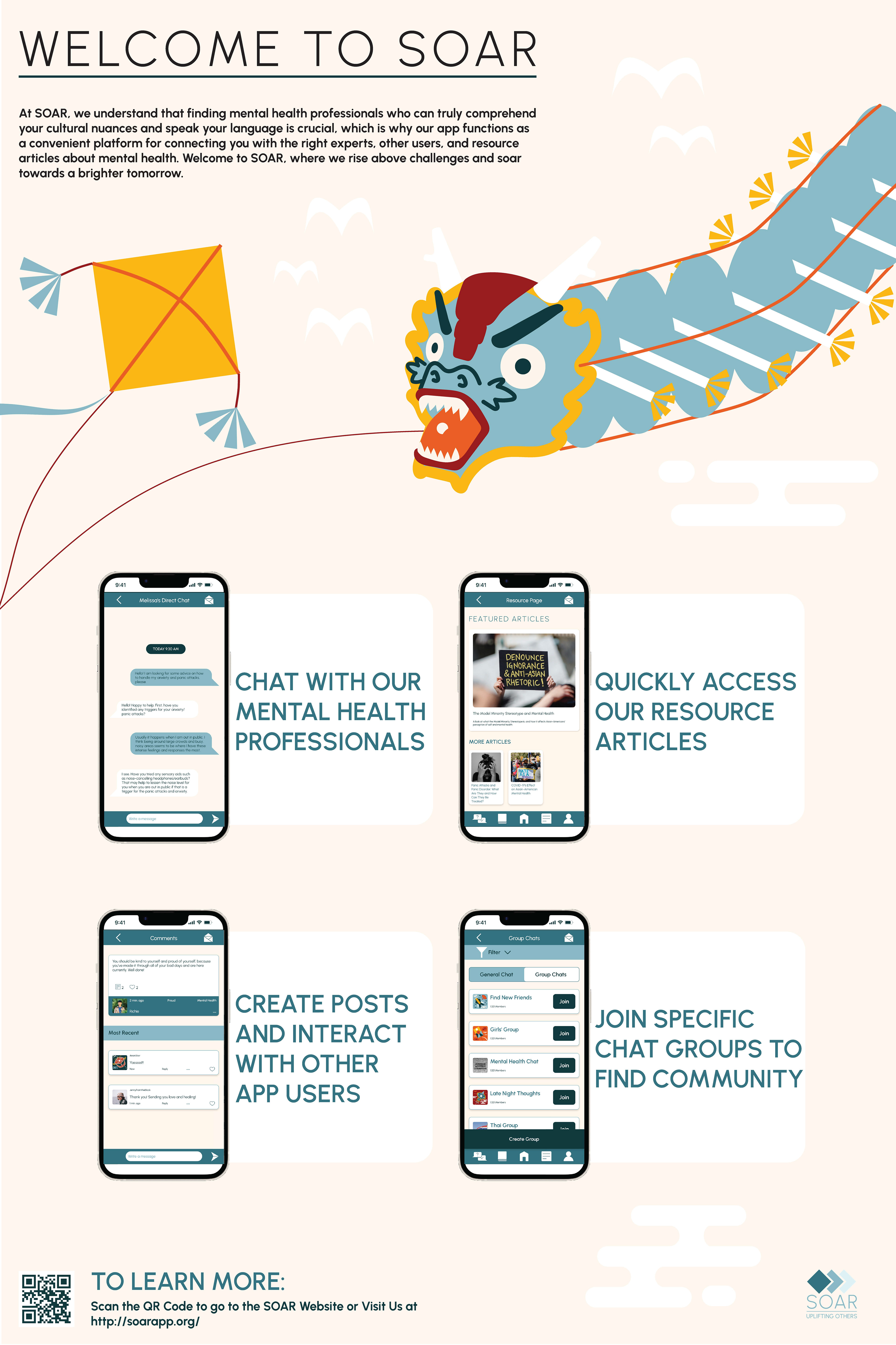
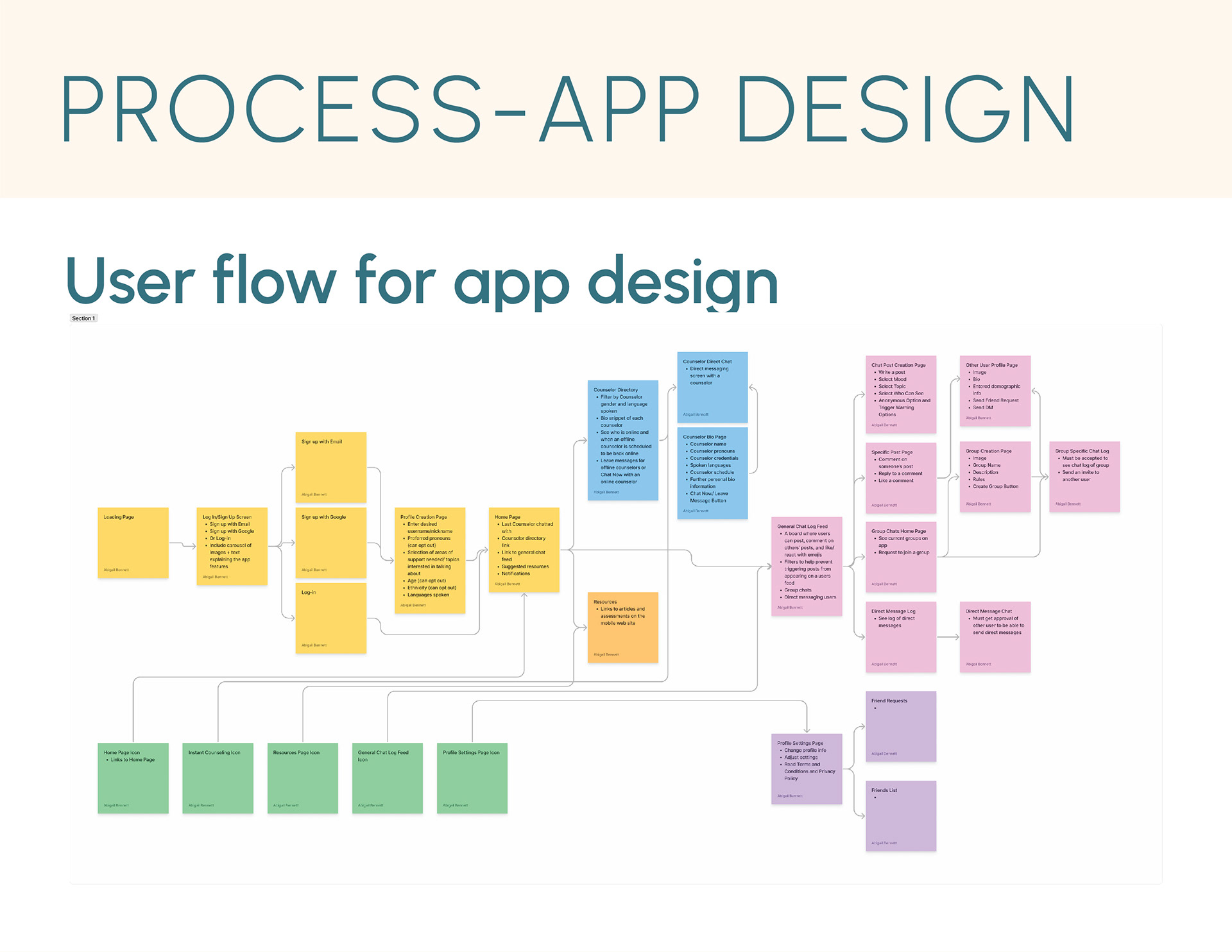
Once I had done my research and auditing, I mapped out the user flow for what I wanted the app to accomplish: connecting users to Asian-American mental health professionals, linking to resource articles on the website, and both general and group chats to connect with other users dealing with similar issues to encourage community.
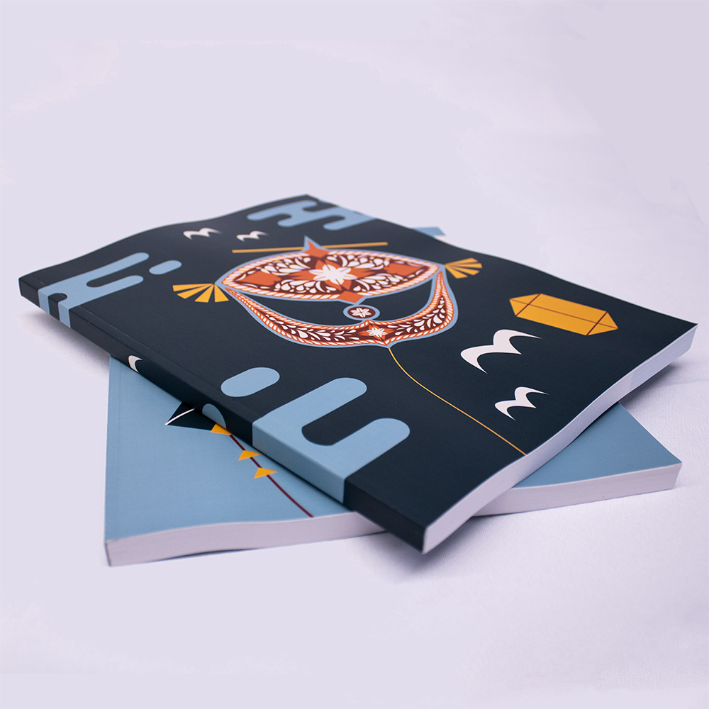
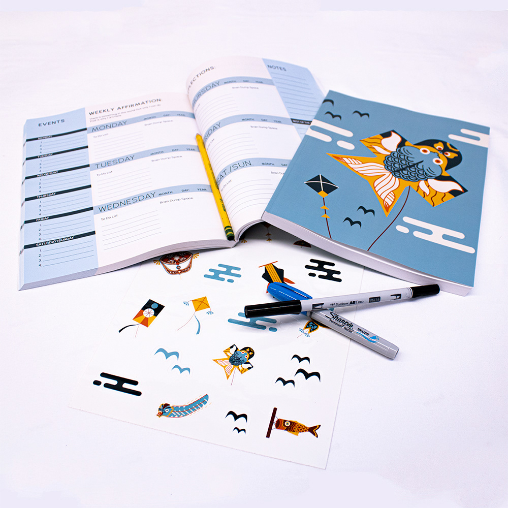
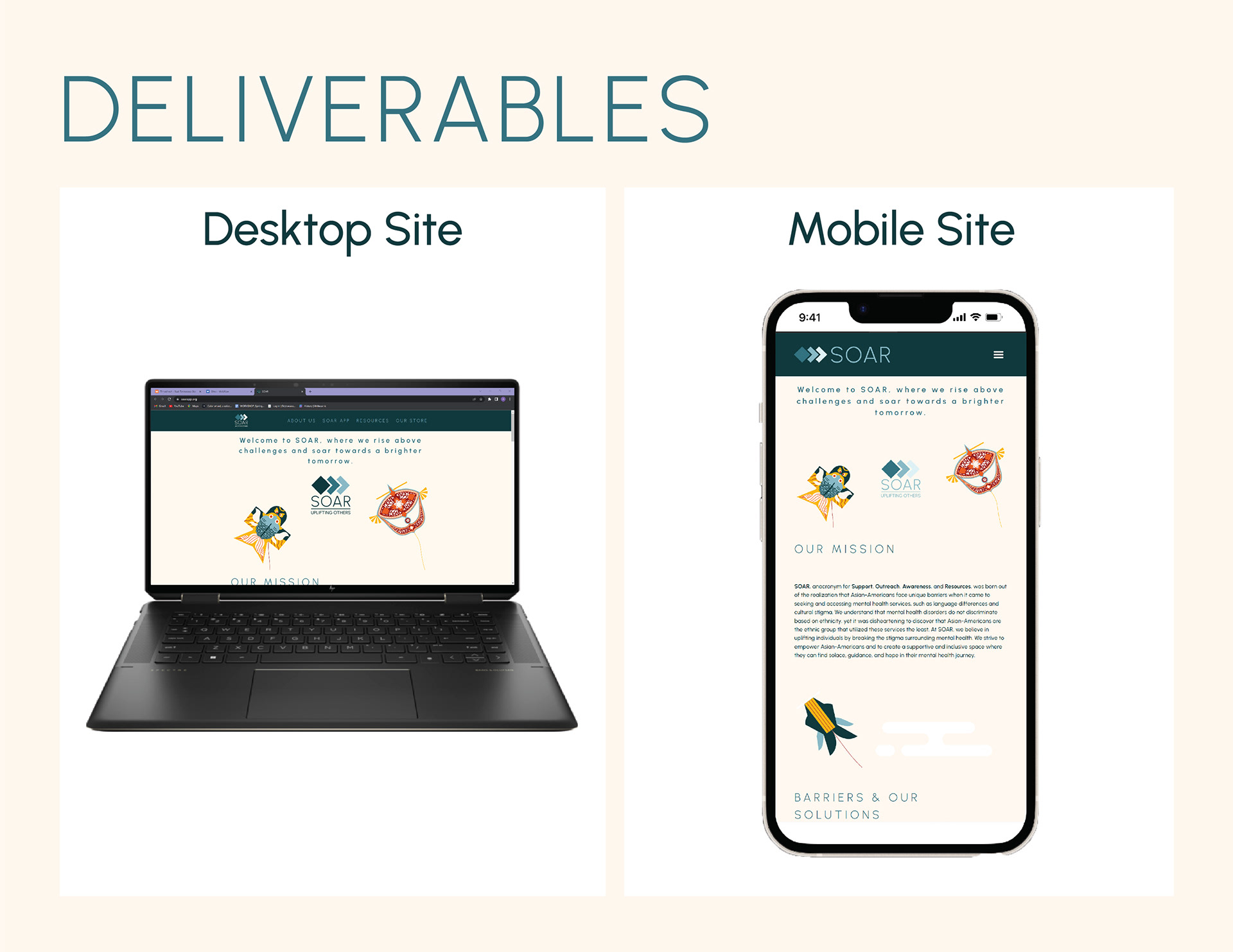
The website site map laid out the structure of the website. A place to provide information about the organization, directing people to the app, housing resource articles about mental health and the Asian-American community, and including a storefront for people to by journals, stickers, and prints.
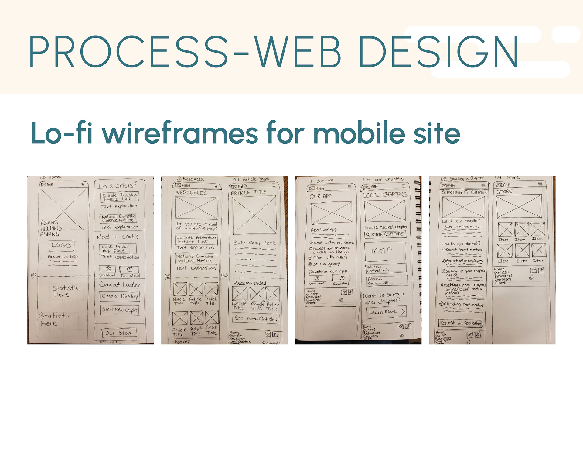
After defining the structure for the site and the app, Lo-Fi and Hi-Fi wireframes were sketched and produced in Adobe XD and Figma.
Step 3: Branding and Style Guides
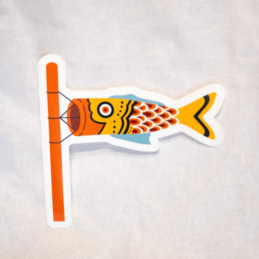
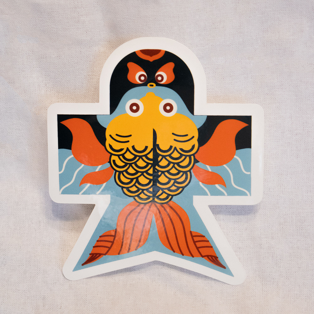
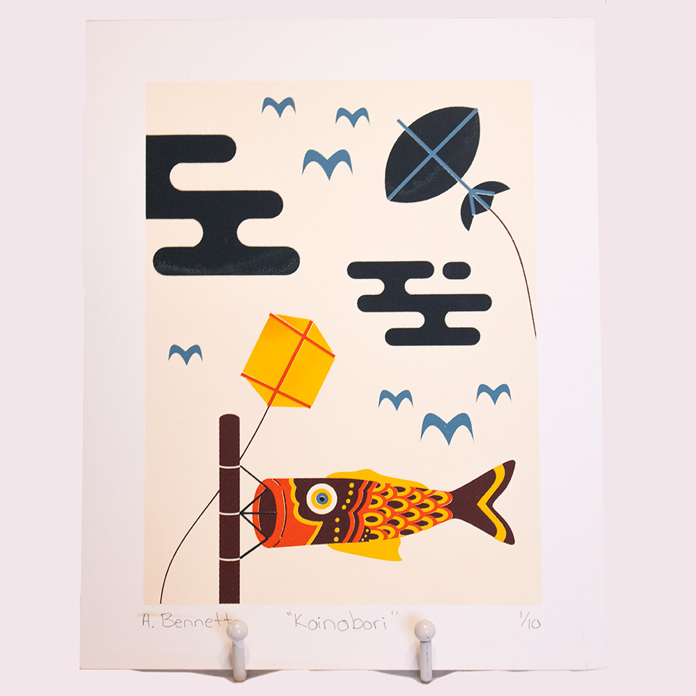
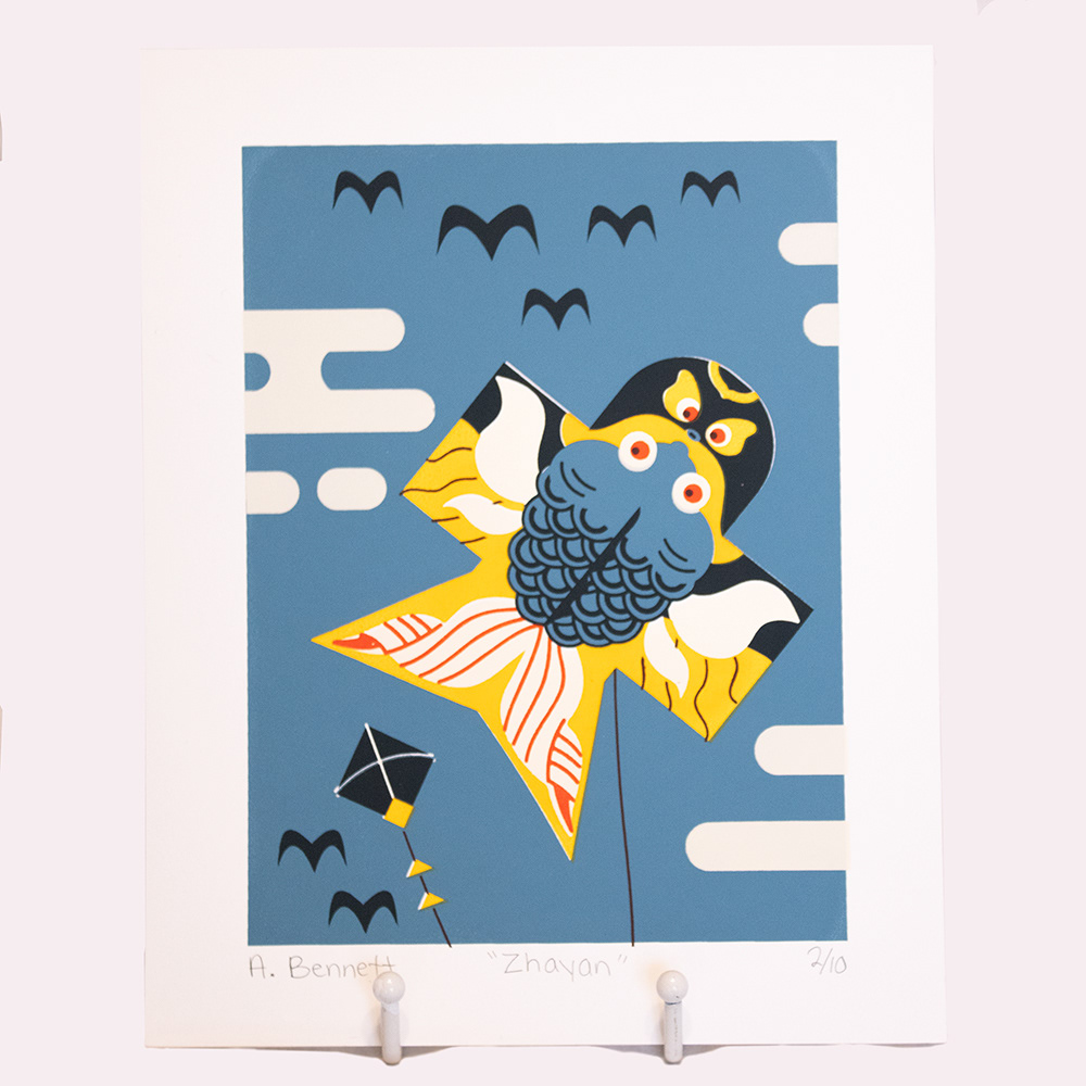
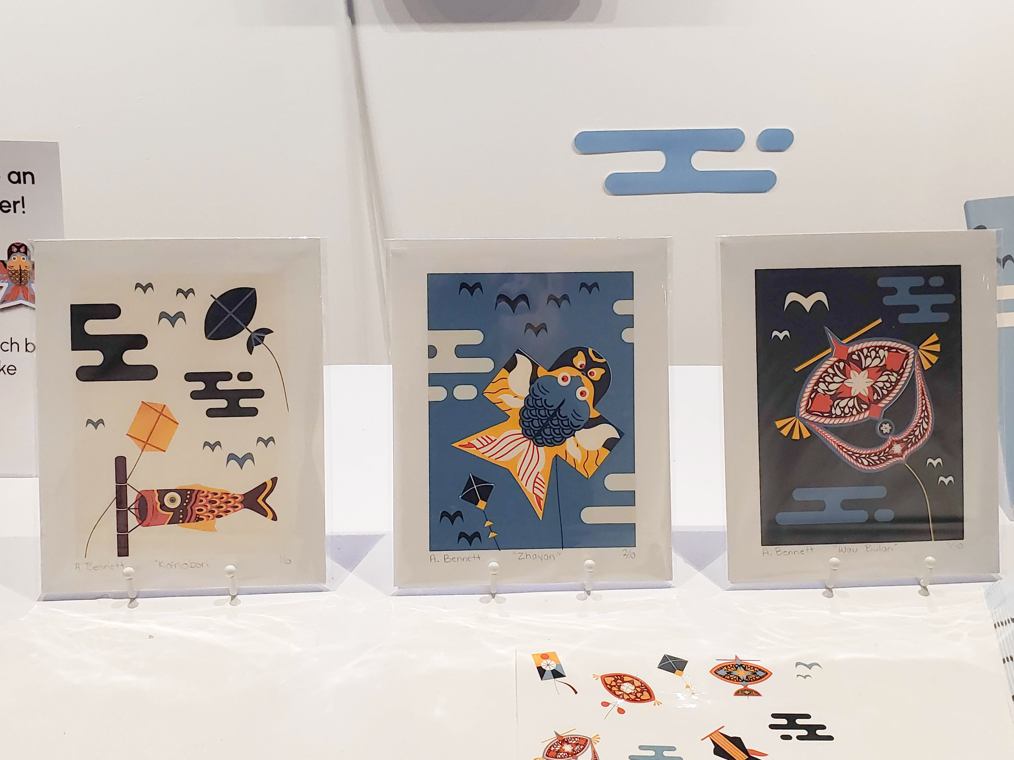
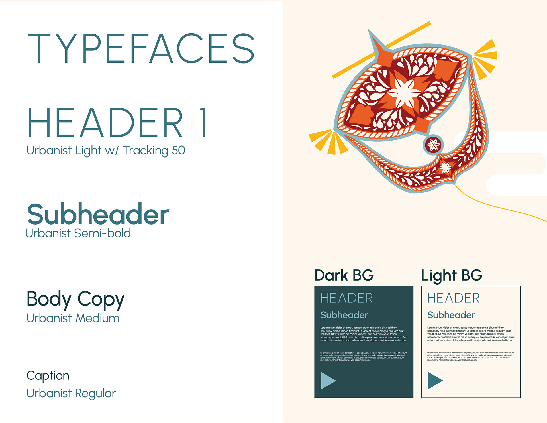
After much exploration and trial, I found that kites were a unifying element found across South, Southeast, and East Asian cultures. I used these kites as key graphic elements in my designs, as well as in my color scheme. For my typefaces, I went with the geometric sans-serif typeface Urbanist in a variety of weights and tracking spaces to keep the app and site simple and easy to read.


Step 4: Production
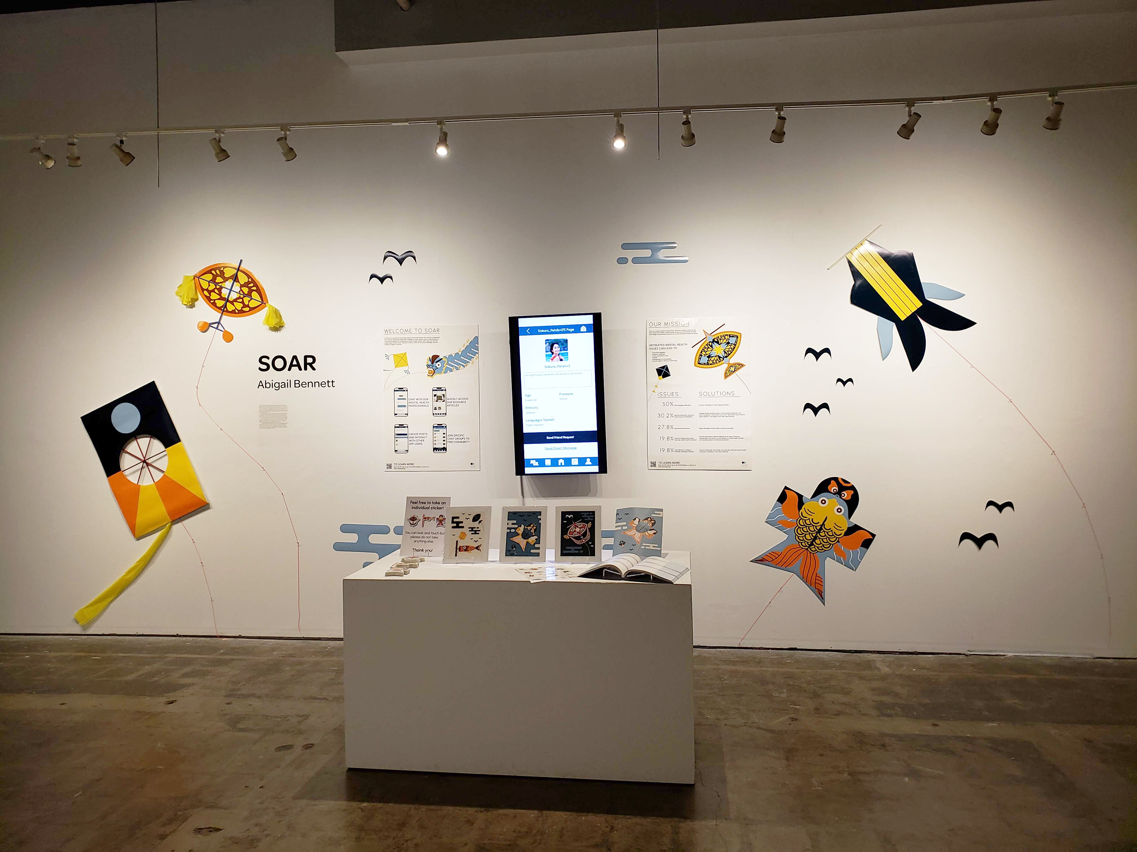
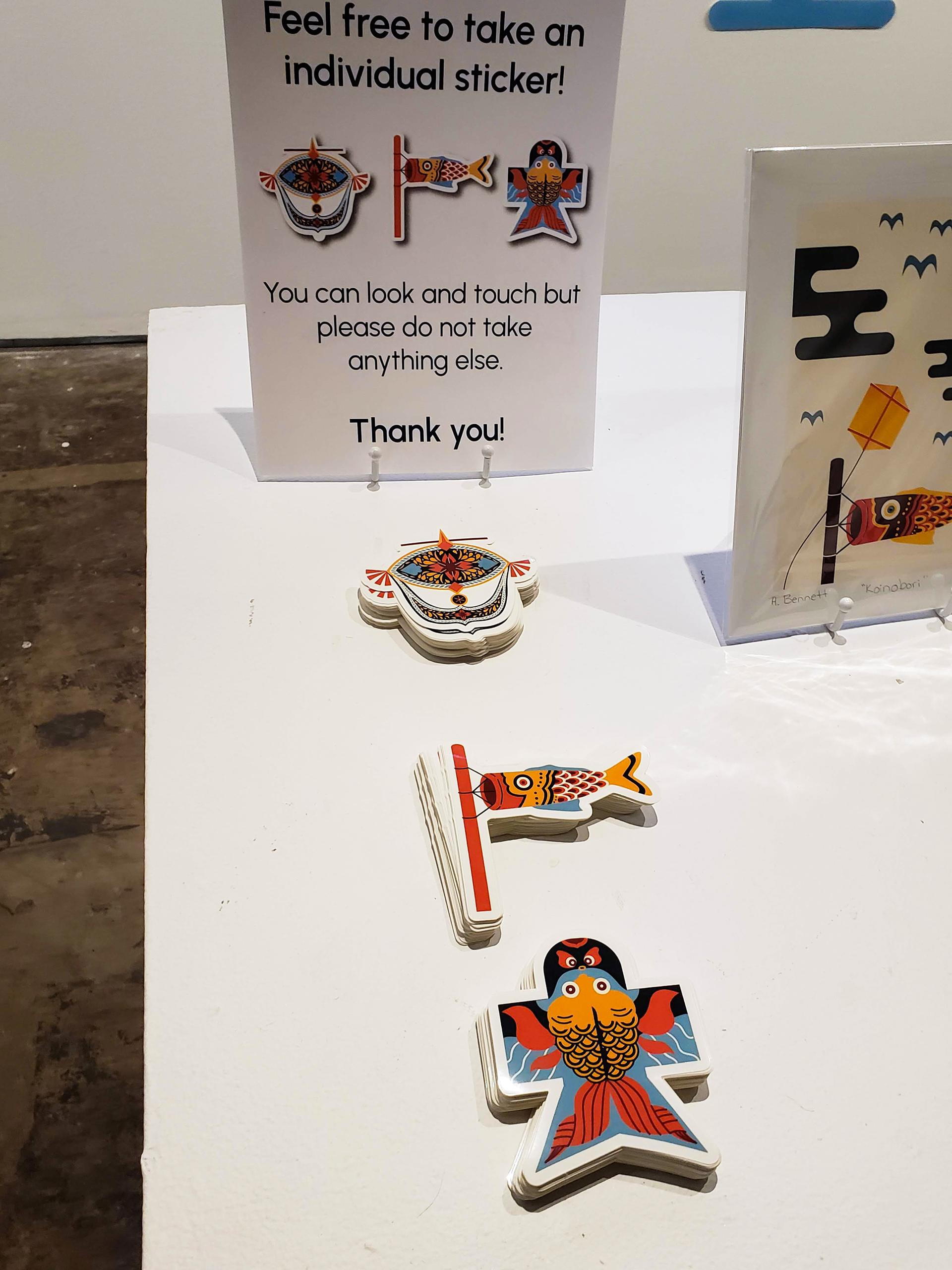
Below are images of the physical items created (journals, stickers, and prints), a video of the SOAR app mock-up, and a link to the SOAR website. At the top of the page, there are photos of the museum installation that was up from November-December 2023.